Case 05 · Campaign
Diet Coke
Love What You Love
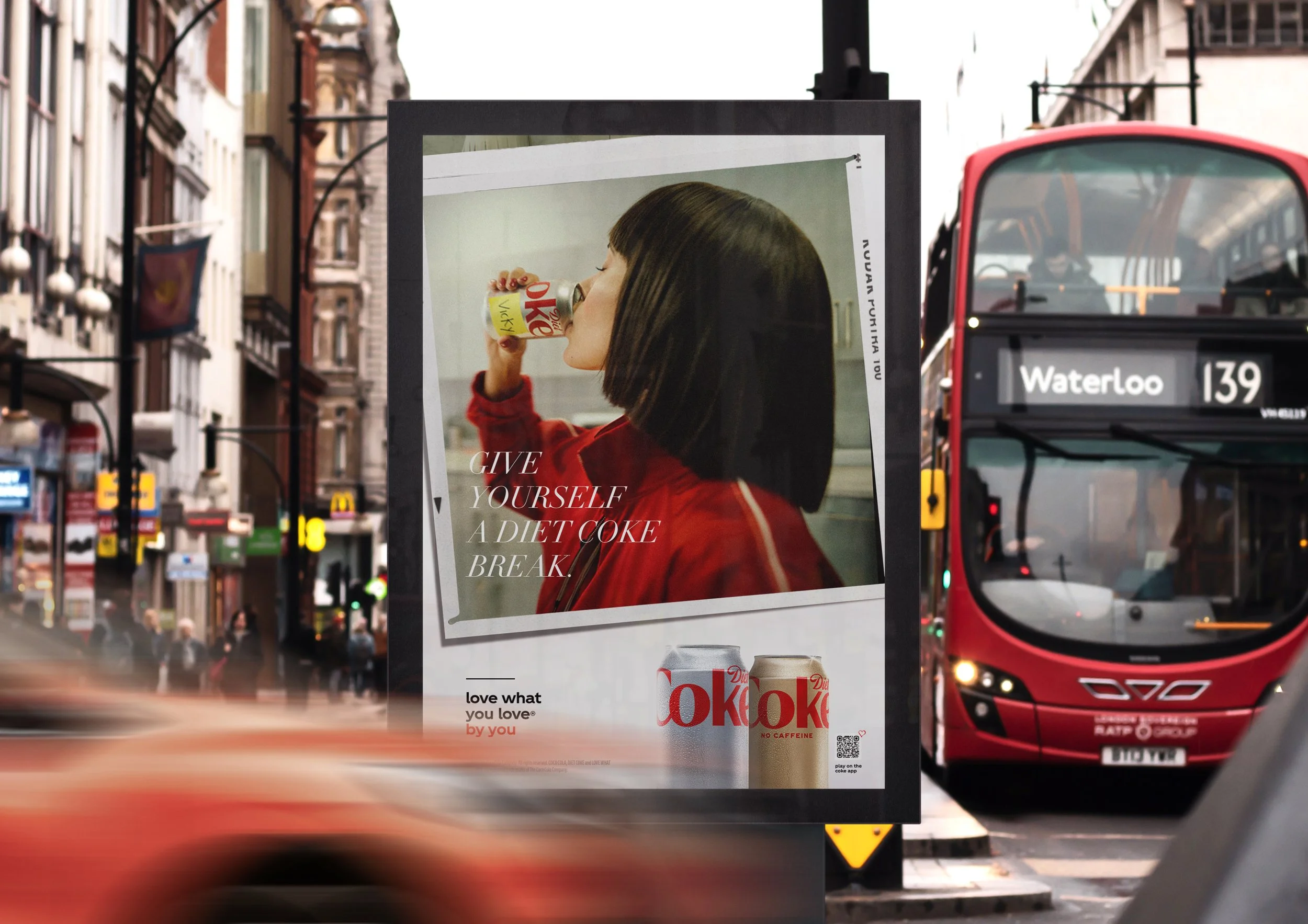
A brand break you could put your own name on — and a design system built so 150 names didn't mean 150 layouts.
The design system
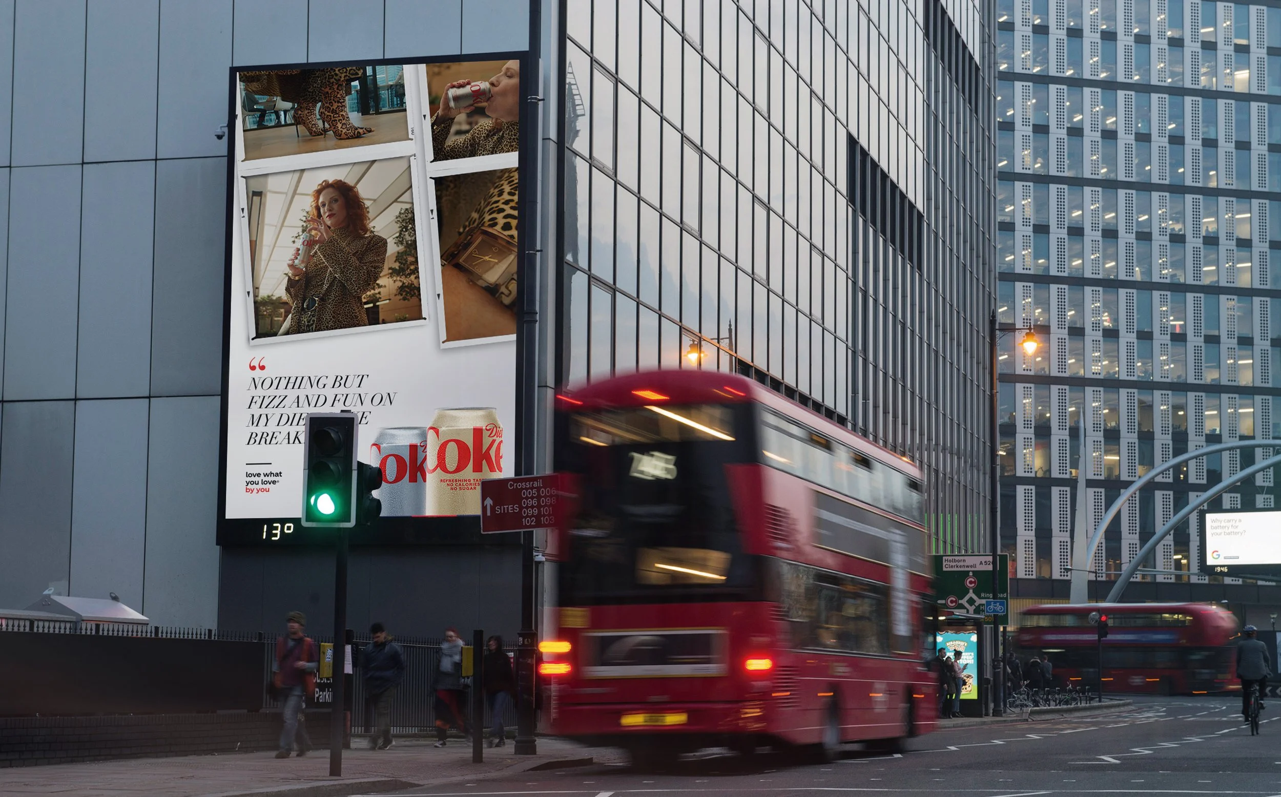
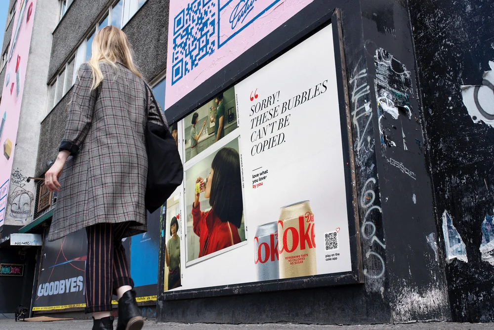
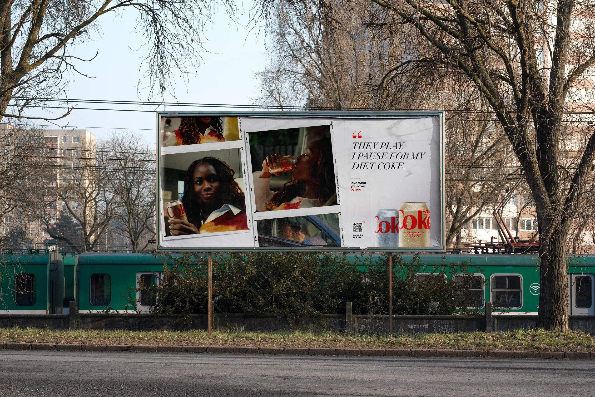
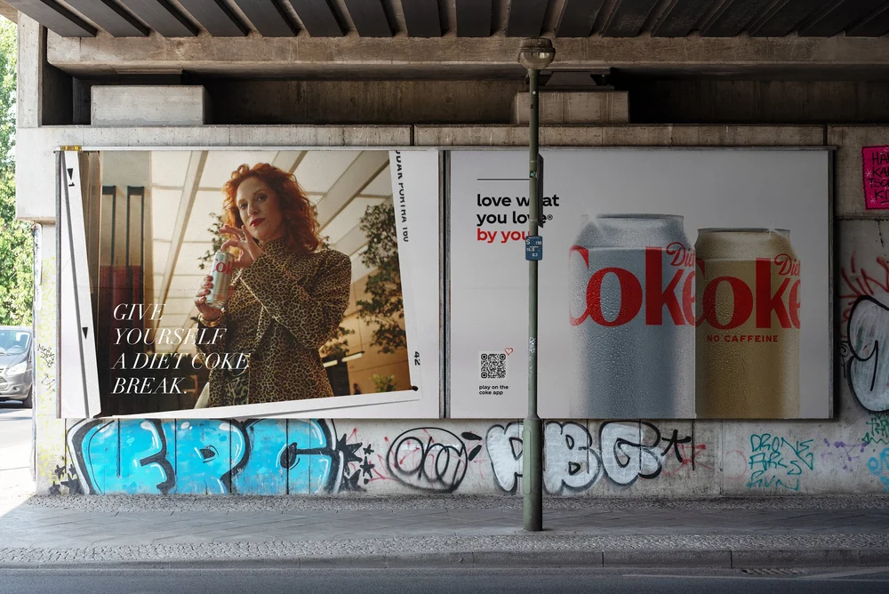
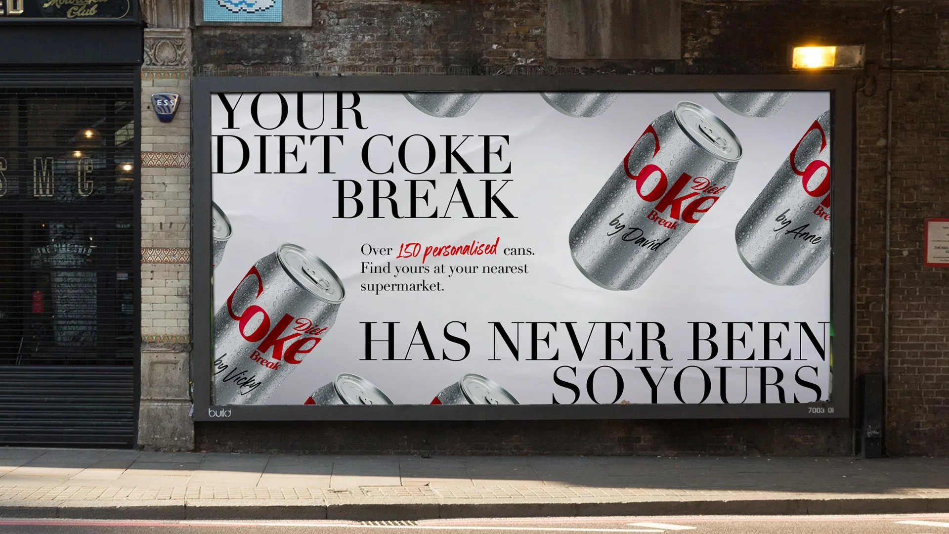
The whole campaign runs on one photographic grammar: snapshots with white borders, sprocket edges and frame numbers, taped down at a slight angle, with a handwritten name label on every can. It reads as something found rather than something produced.
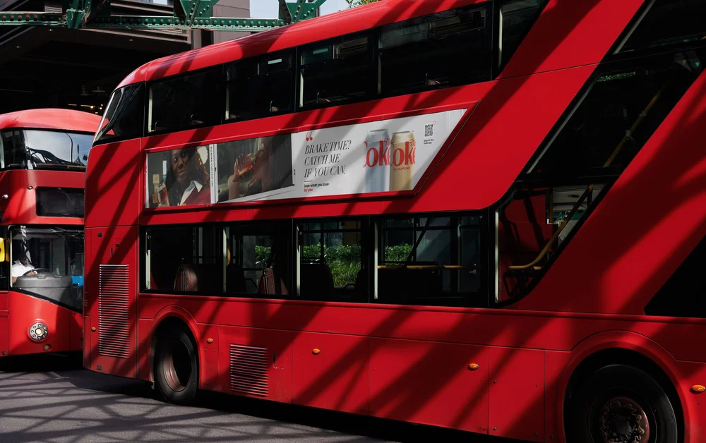
Against that, a single typographic move — a high-contrast Didone italic carrying a first-person line, with a red quotation mark as the only ornament, and the love what you love® / by you lockup held constant at small scale in every format.
Two fixed elements, one variable. That is what let the system stretch from a bus fillet to a 48-sheet to a vertical digital screen without a single execution needing a bespoke layout.
The system across formats
Film
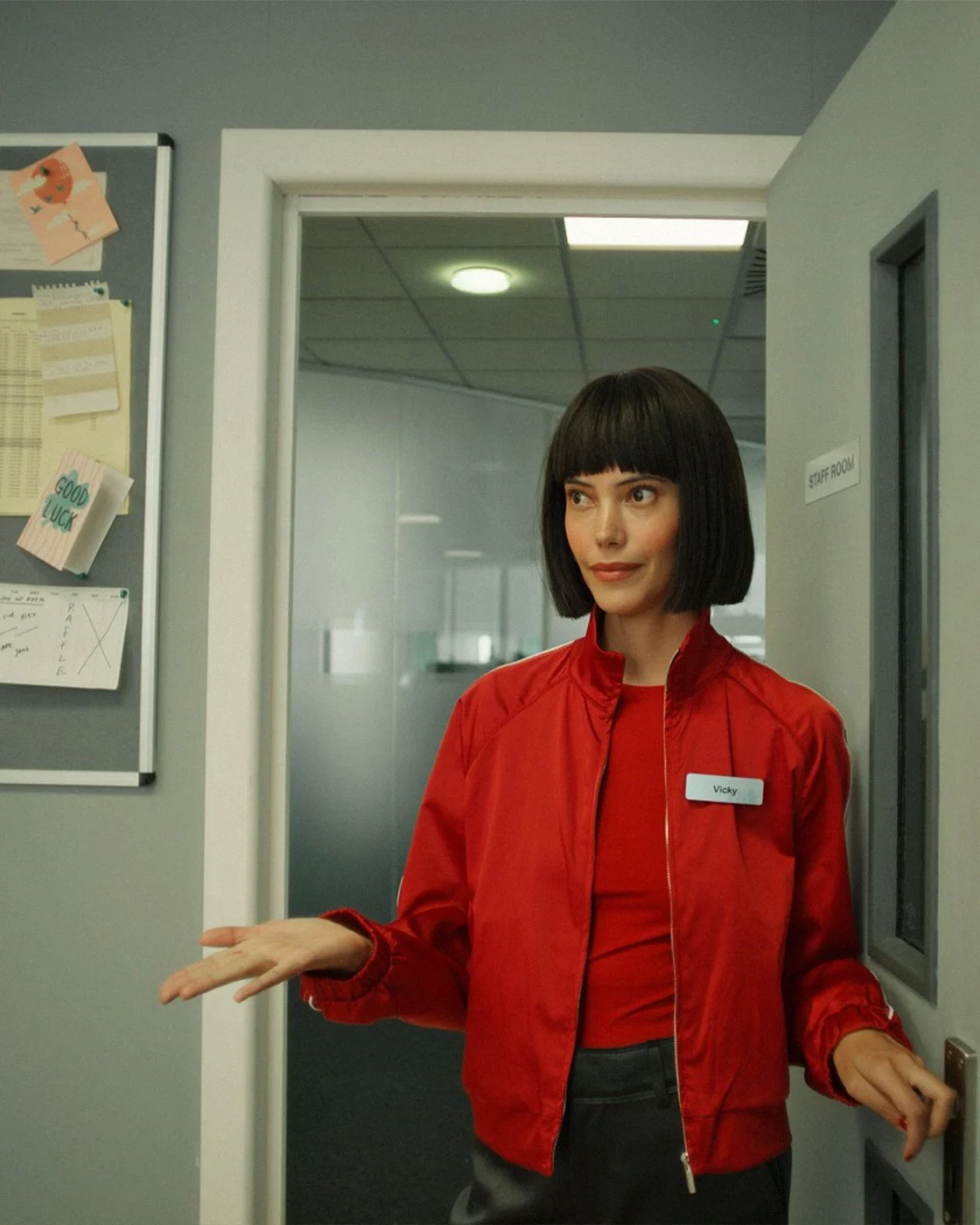
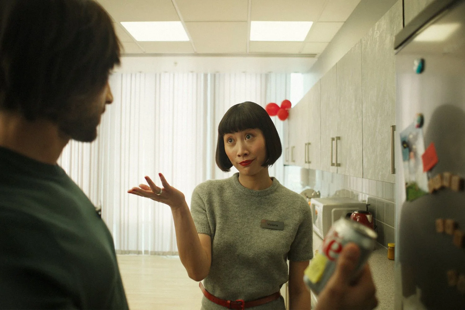
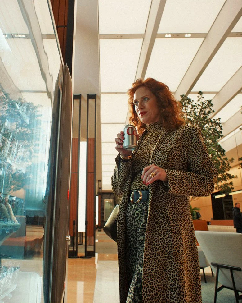
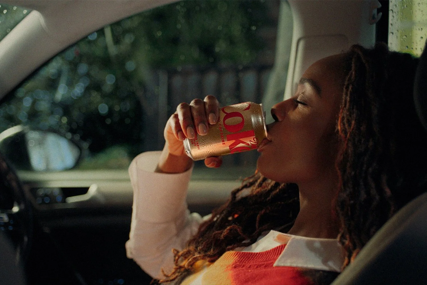
Naturalistic, grain-forward, staged in ordinary interiors — the film is shot to look like the place the snapshots came from.