Case 04 · Campaign
Coca-Cola
Classic with a Spin
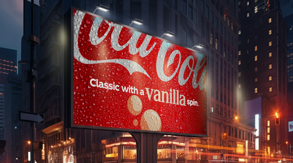
The proposition is a choice. So the work makes you make one — on the poster, and then with your own face.
Two languages, one idea
Outdoor holds a single sentence and changes one word in it. Classic with a ___ spin. The flavour word is the only variable, and it carries everything: its own colour, its own weight, its own fruit dropped into a red field that never moves. Condensation does the appetite work; the type does the rest.
Digital breaks the register completely — acid gradients, 8-bit sprites, sticker type, emoji punctuation. Not a translation of the poster into a phone, which is where most campaigns lose teenagers, but a different language chosen for the place it runs.
What holds the two together is the mechanic. This or That tracks your head and asks you to tilt left or right to pick a side. The choice in the product becomes the thing your body does. That is the join, and it is the reason two registers this far apart still read as one campaign.
The same idea, made playable
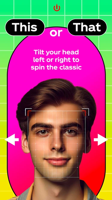

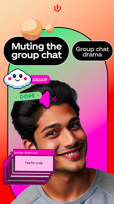

Every filter is the same two-option structure, and the questions get sharper as they go — a flavour, then a pet, then how you actually feel when you say you're fine. The pack loops run in the same register rather than cutting to polished product.
One sentence, five flavours
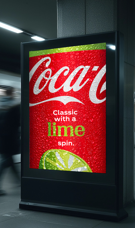
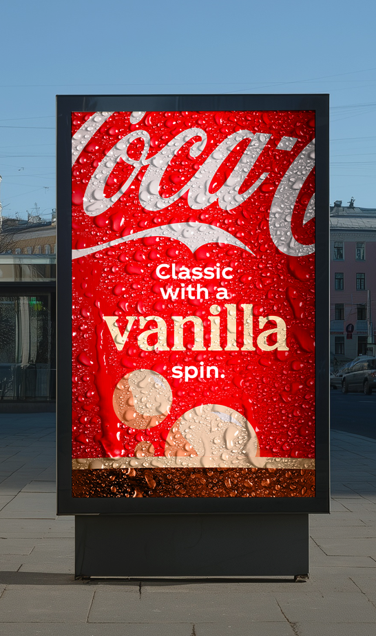
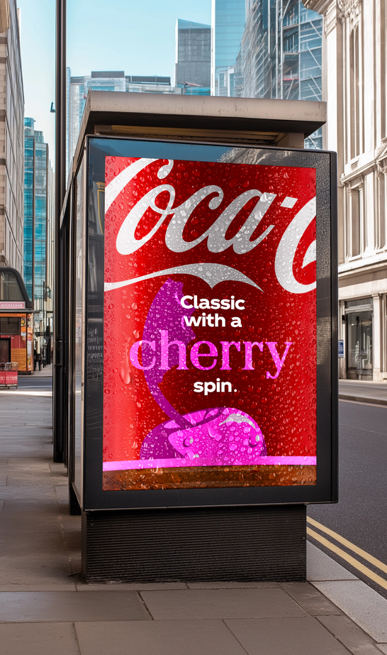
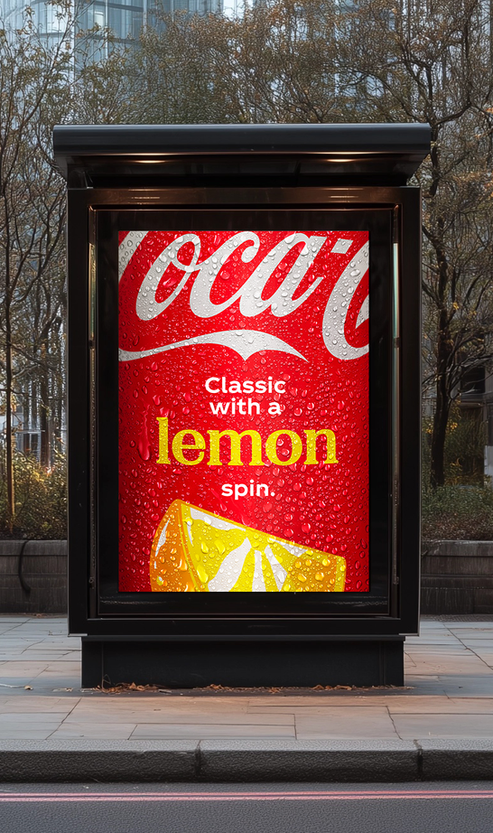
Shown as a strict grid on purpose. The regularity is the point: one layout, four flavours, no bespoke artwork anywhere in the set.